Wardrobe Tips
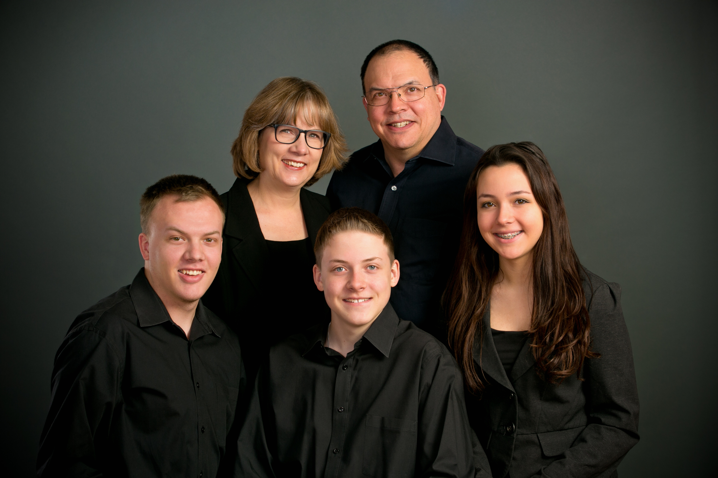
MEDIUM–TO–DARK, SOLID COLORS ARE BEST
Being photographed in the appropriate clothing will help you look your best and will allow for the most visually pleasing portrait. Long Sleeve, Solid, dark gray, black, dark blue, dark green offer a safe and traditional look that is guaranteed to flatter. Avoid Large Prints and Stripes! Dark solid colors are the best options as they do not distract from the portrait. They allow for the focus to be solely on the faces of those being photographed and not distracted by something that isn't as important.
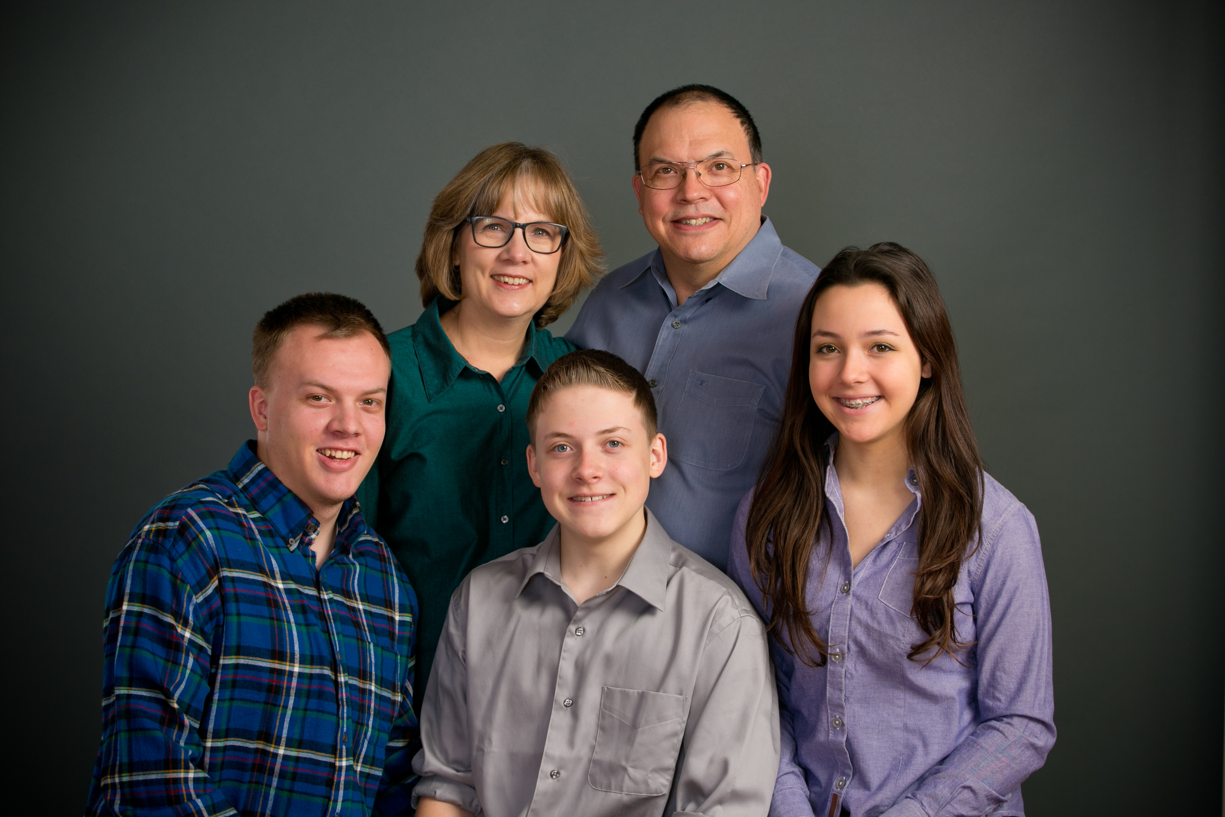
SIMILAR SOLID COLORS
Colored clothing certainly can be an appropriate choice for a portrait however be careful when choosing the colors. Colors should be carefully coordinated and must work well with the other colors in the image. In this example, the brighter shades are competing with the darker shades. Depending on who you are, your eye may want to look more at the dark green shirt or perhaps you may look more heavily at the light grey shirt. Either way, what is not being looked at? The faces in the picture! If you have a good understanding of color theory, you may not run into this problem when deciding on wardrobe but it is always the safest bet to keep it simple and stick with solid dark colors (preferably black).
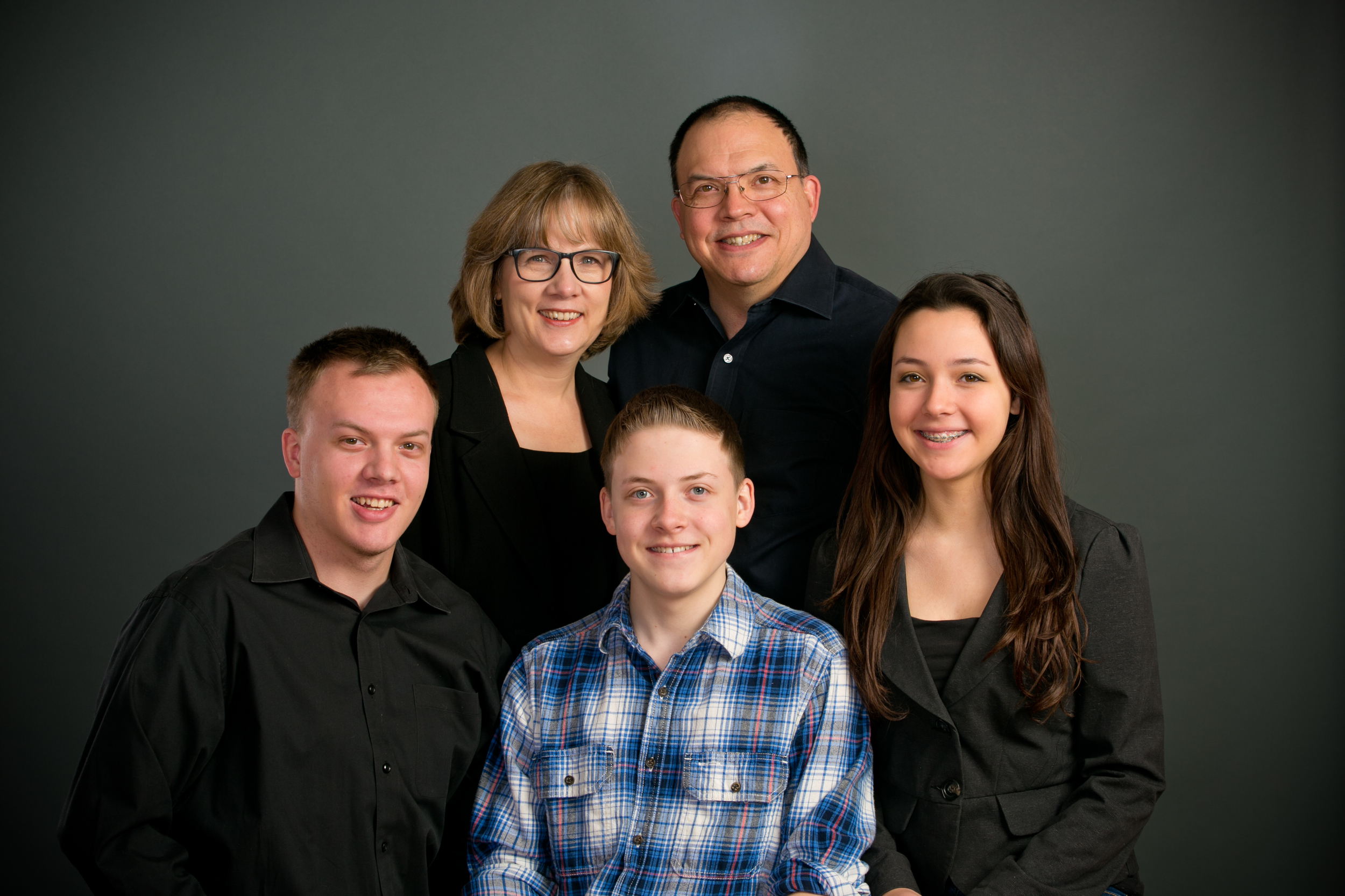
PATTERNS
This is a great example of how several things in a single choice of shirt can distract and draw attention within a portrait. Patterns almost always will cause this problem. Areas with the most contrast in an image will always draw more attention that solid colors as they not only contrast with what others are wearing, but they also have a great deal of contrast within the design of the pattern. This is highly problematic for portraits as they truly can diminish the quality and enjoyment people can gain from looking at an image such as this example. When looking at this image, you can see that the eye constantly wants to look at the patterned shirt and can even get stuck only looking at this area in the photograph.
SLEEVES VS. SLEEVELESS
It's important to consider the style of clothing that you can choose from. There are so many different styles of clothing that it can seem a little daunting to think why one may be a better choice than another. Don't worry, it can be the easiest choice you can make. Long sleeves are always the "go to" for a quality portrait. The reason is simple; our eyes are prone to being drawn to specific elements of a visual display. One very easy way to distract from the face in a portrait is to have an area in the image competing with the faces such as bright vertical lines that the skin in the arm presents. Take a look at this image for example. The eye wants to travel throughout the photograph but will typically venture away from the faces and give far too much attention to the bare arm.
PATTERNS AND COLORS
Wearing something that is different and obvious in a photograph is rarely a good idea. In this image, it's clear to see that the blue plaid shirt is drawing attention to itself. Not only is the pattern in the shirt bringing vertical and horizontal lines into the picture, but the color of the blue isn't exactly within the same color palate that the others are wearing. This can completely ruin a portrait and it can easily affect whether or not you end up liking the image or not. Be cognizant of your wardrobe choices as it can completely change the portrait experience and likely your taste in the overall photograph.
PATTERNS, COLORS AND LOGOS
This is a great image to capture everything listed above plus one additional issue that we discourage; logos. Apart from the patterns and random use of color in this image, distinguishable logos, and especially text, always can distract from the overall aesthetic of a portrait. It may not be a very large area in a photograph however once it is seen, it is hard to not continuously go back to it with the eye. In this image, we have bright colors, dark colors, floral patterns and plaid. This instantly becomes extremely busy and overly visually stimulating. The eye continuously bounces around the image and never truly stays where we want it to, the people's faces.


